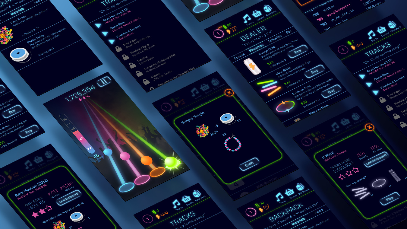
Rave Heaven is a rhythm-tap mobile game concept for fans of Hardcore music and rave culture.
Hardcore Techno (usually just called Hardcore) is a type of Electronic Dance Music that originated in Europe in the 1990s. It’s typically characterized by fast tempos (160–200 BPM or more), hard kicks, and having about a million sub-genres for which no one can agree on proper definitions.
This music is best enjoyed at raves, where DJs and ravers come together in the spirit of PLUR (Peace, Love, Unity, Respect) to dance the night away to the music they love. The main downside to raves is that inevitably, the night must end and everyone has to go home to their boring lives without hard beats and laser lights. Rave Heaven seeks to address that problem by bringing a piece of the rave experience to the smart phone.
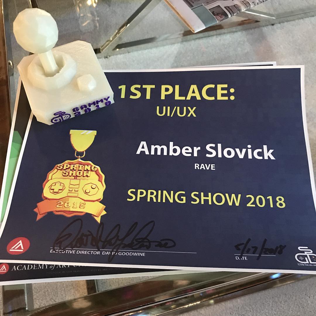
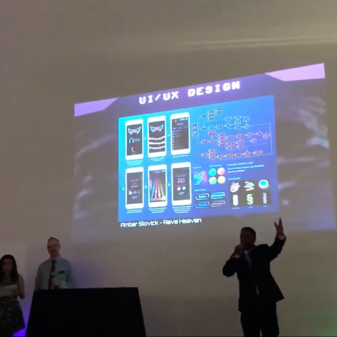
Every May, Academy of Art University puts on a Spring Show exhibition to showcase the best work created by the top students in each department in the past year. They invite hiring professionals from various art and design industries to visit to scout out top talent. In May 2018, not only was my work on Rave Heaven featured in the Spring Show, but it was chosen by the School of Game Development as the Best UI/UX Design of 2018!
I’ve been a big fan of Hardcore music since 2009 and have attended several raves since 2011. These experiences have given me unique insight into rave culture, which informed many of my design decisions during this project. For example, there's no way to directly buy kandi (colorful bracelets) in the game because in real life, kandi is only crafted and given away. It's considered taboo to sell kandi for profit (I'm looking at you, Hot Topic).
I downloaded 10 rhythm-tap games from the App Store and played at least the first level of each one. As I played, I wrote down everything that frustrated or delighted me as a user. These observations influenced many of my design decisions later on.
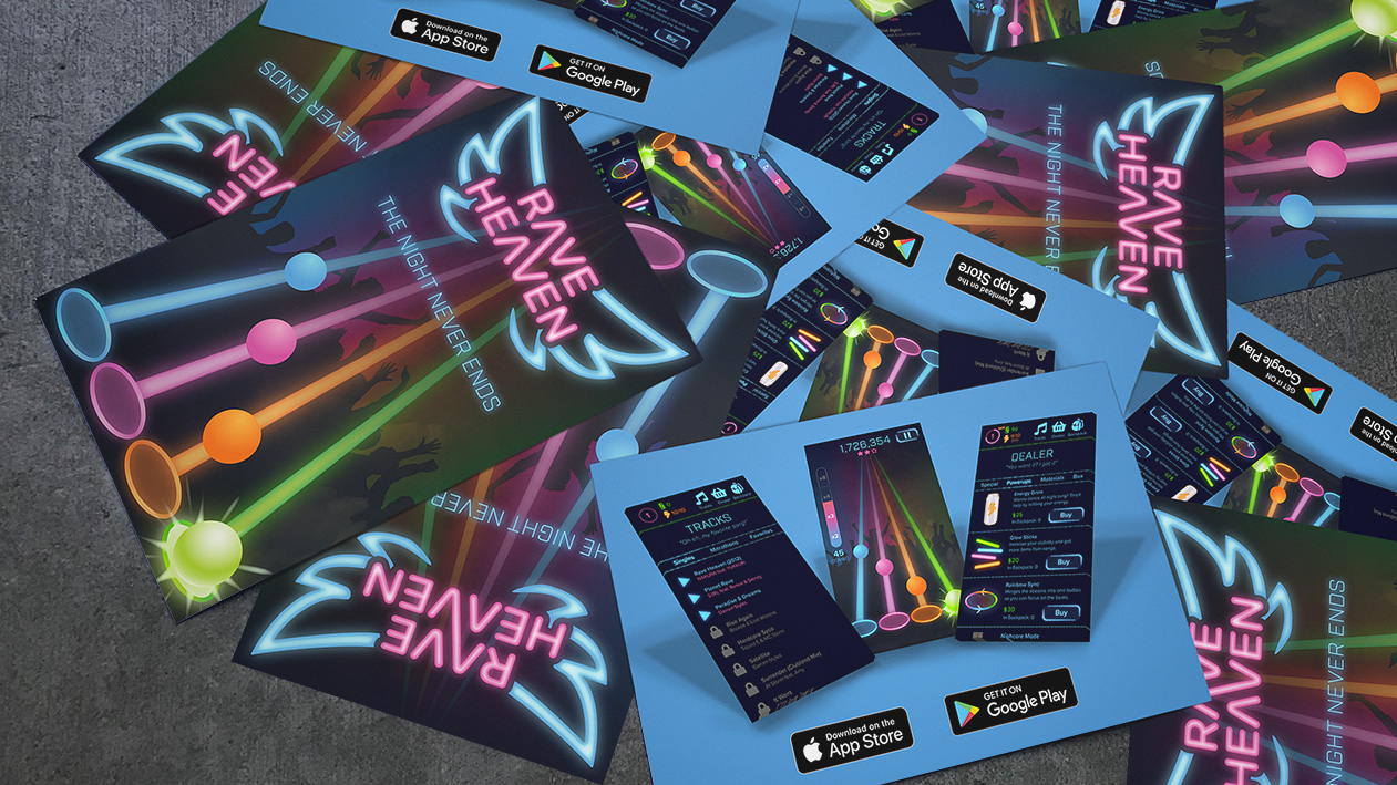
Rave Heaven would be advertised the same way raves are typically promoted: via small promotional flyers handed out and scattered on the ground at raves and near venues where raves are held. The messaging of the ad is inspired by several songs expressing a sentiment of wishing the night would never end.
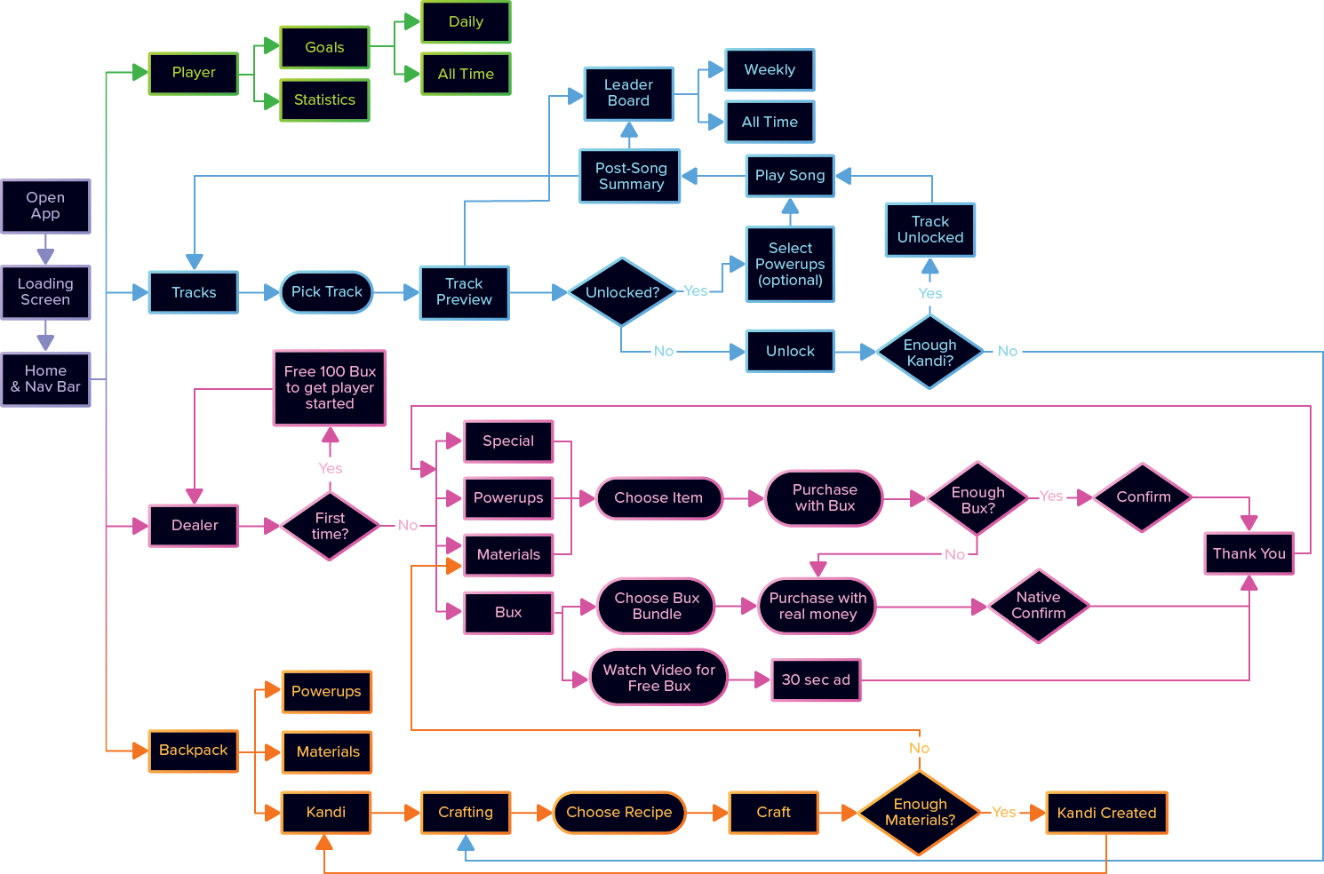
I first started by making a flowchart to organize all the things I wanted in the game. When I finished the first draft of the flowchart, I started working on wireframes in order to figure out the placement of elements without getting too caught up in the visuals of those elements. I ended up modifying the flowchart as I went along to accomodate decisions I made throughout the process.
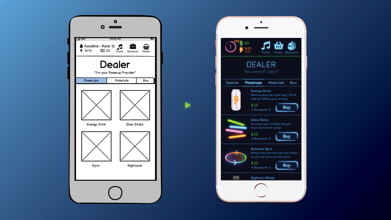
After I had enough wireframes to cover a short, simple task, I did some rapid-fire informal usability testing with several of my classmates. These tests revealed the major issues with my initial wireframes, which I addressed in my first round of high-fidelity designs.
I built out high-fidelity versions of several tasks, put together an InVision prototype, and conducted a semi-formal usability test with a member of my target audience. I adapted my script from Steve Krug's Rocket Surgery Made Easy. Since my test participant is a longtime friend of mine, I skipped a few of the formalities in order to help her feel more comfortable. She gave permission for me to share the above video.
I discovered several usability issues, which I addressed in the next round of designs. The test also helped confirm what was working well, like the "NEW" indicators and the stats in the upper left.
Goal: Play the track Rave Heaven by NAKURA feat. YUKKURi.
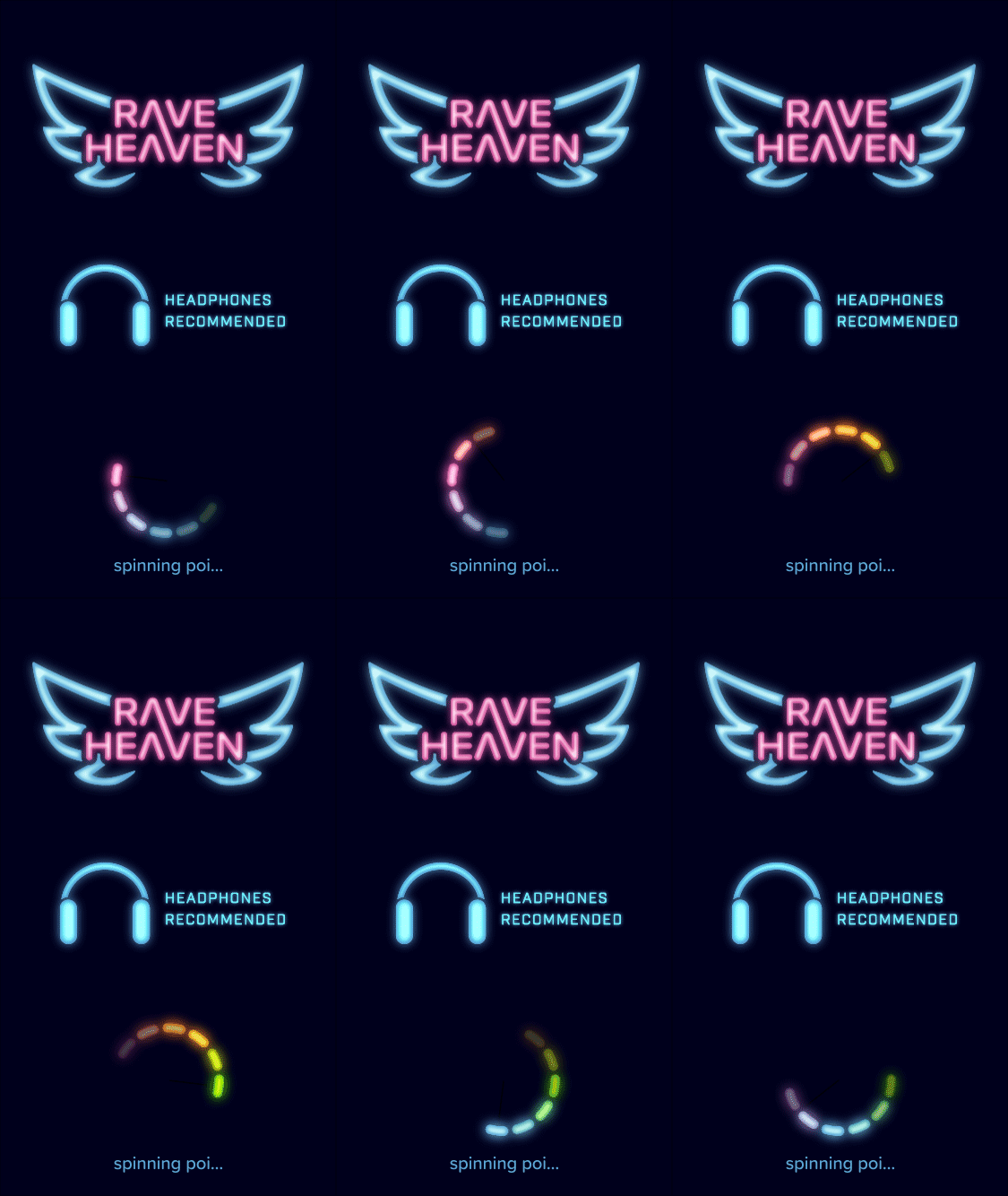
1.1 As the game loads, the user is reminded to wear headphones.
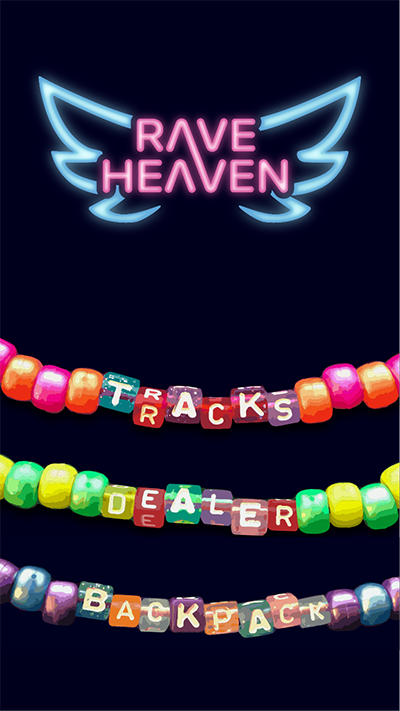
1.2 Tap Tracks.
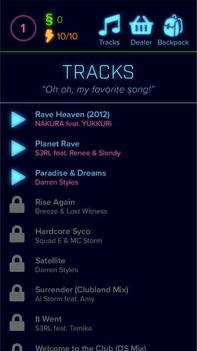
1.3 Choose from the available tracks.
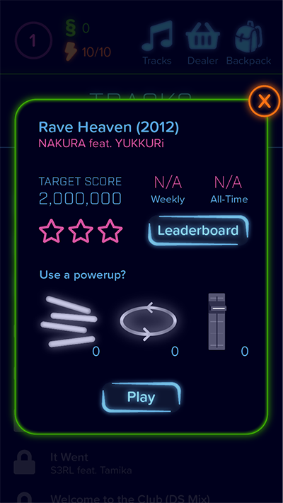
1.4 Optionally view the leaderboard or choose a powerup, then tap Play.
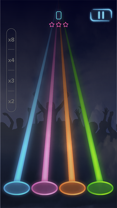
1.5 Tap the orbs to the beat of the music, using combos to get high scores.
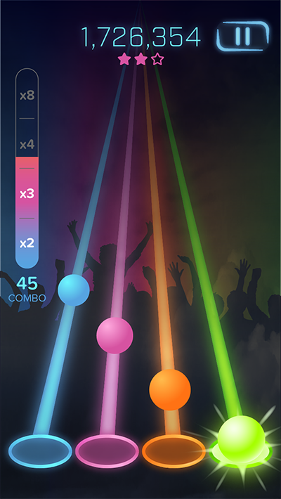
1.6 The intensity of the colors & shaking of the background match the intensity of the music.
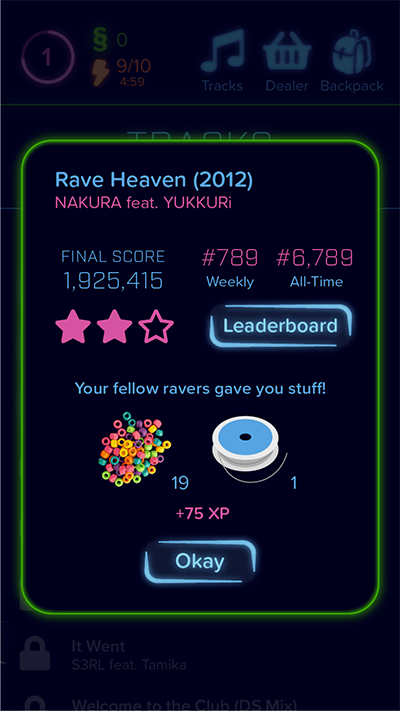
1.7 The user receives rewards based on their score. These items can later be used to unlock new tracks.
Goal: View a track's Leaderboard before playing the track.

2.1 When viewing track details, tap Leaderboard.
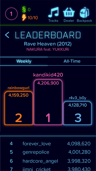
2.2 View Weekly Leaderboard.
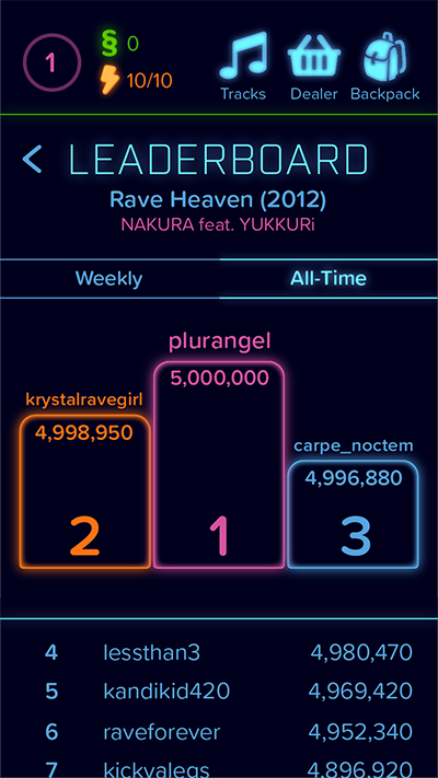
2.3 View All-Time Leaderboard.
Goal: View a track's Leaderboard after playing the track.

3.1 While viewing post-track summary, tap Leaderboard.
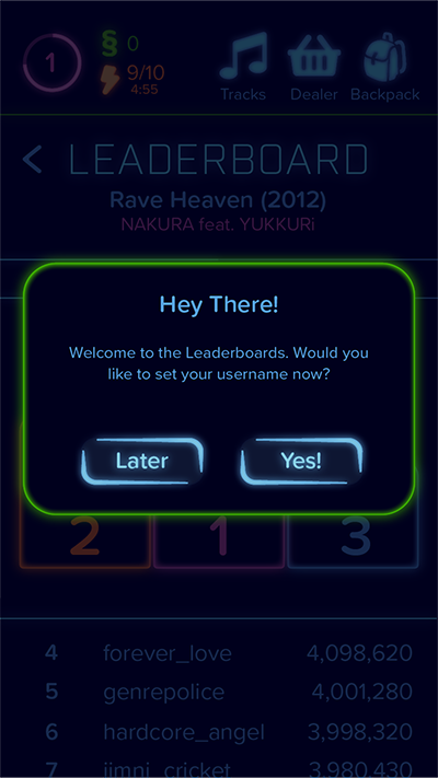
3.2 Choose Yes.
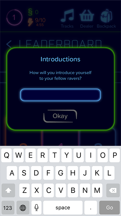
3.3 Keyboard appears.
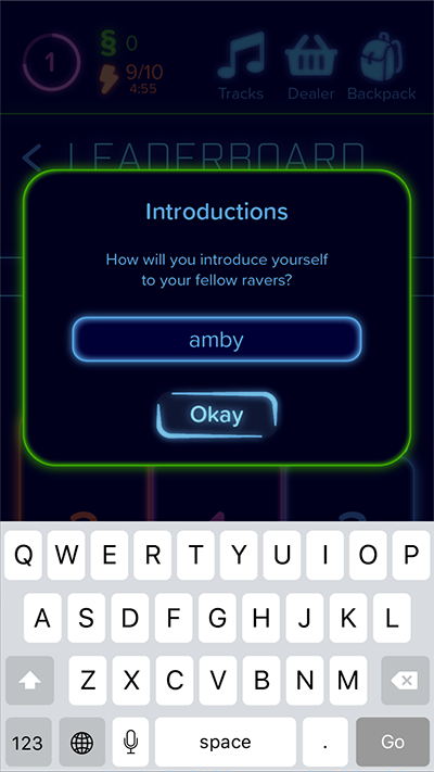
3.4 Type desired name and choose Okay.
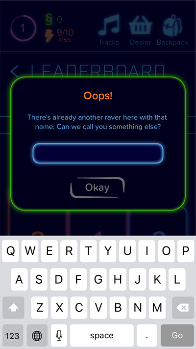
3.5 If a username is already taken, the user will need to try again.
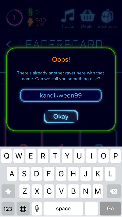
3.6 Type in a more unique username and tap Okay.
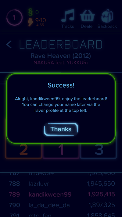
3.7 Tap Thanks.
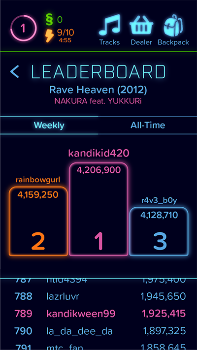
3.8 View the Leaderboard, which automatically centers on the user, but is scrollable in either direction.
Goal: Unlock It Went by S3RL feat. Tamika.
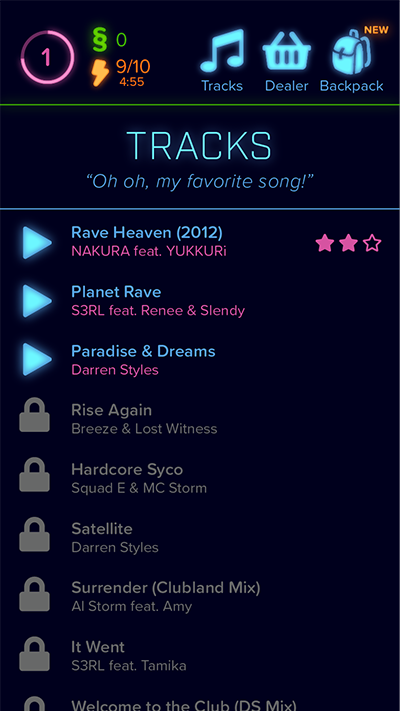
4.1 From the Tracks screen, choose a locked track.
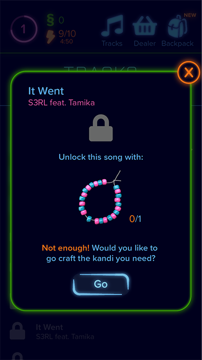
4.2 Tap Go.
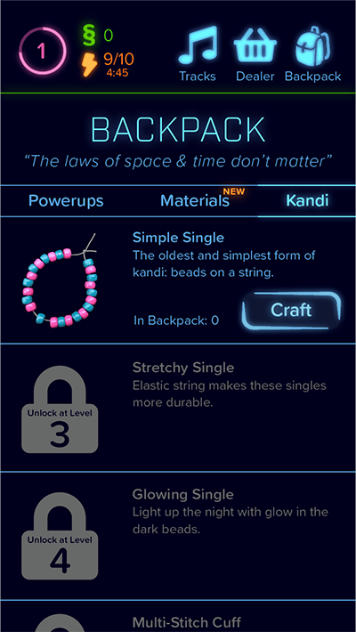
4.3 Tap Craft.
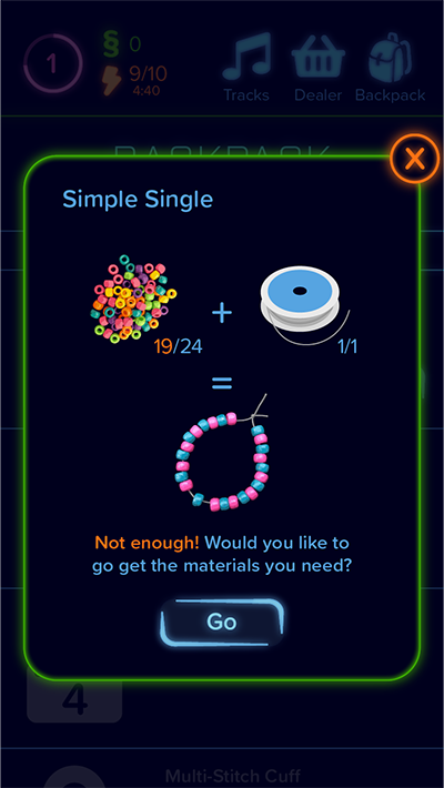
4.4 Tap Go.
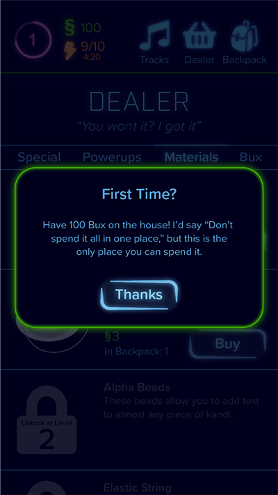
4.5 Tap Thanks.
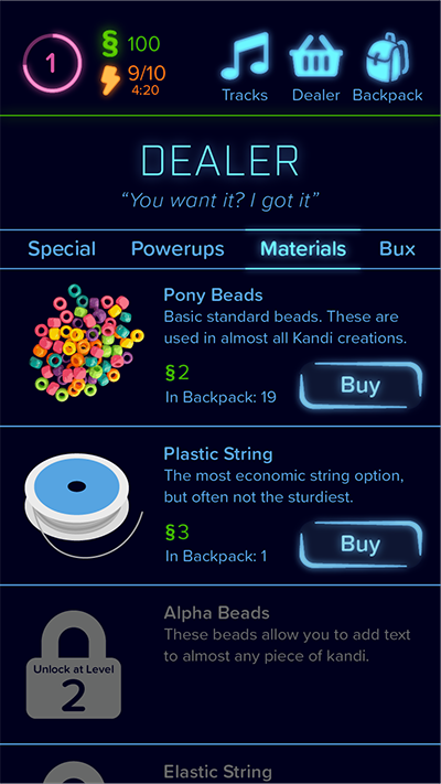
4.6 Tap the Buy button next to Pony Beads.
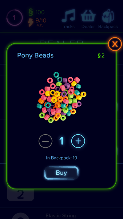
4.7 Tap the + to increase the quantity.
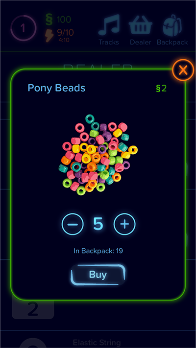
4.8 Tap Buy.
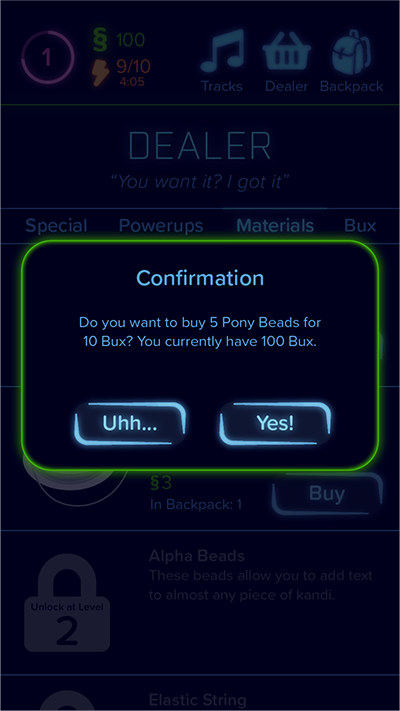
4.9 Tap Yes to confirm the purchase.
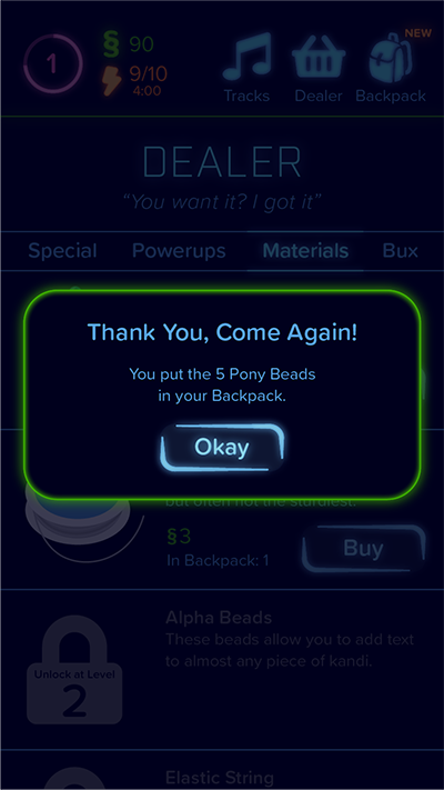
4.10 Tap Okay.
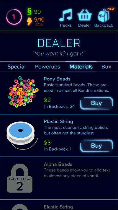
4.11 Go back to the Backpack.
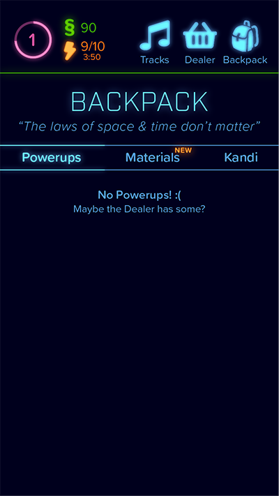
4.12 Tap Kandi.
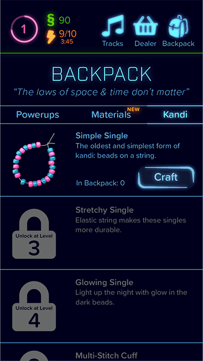
4.13 Tap Craft.
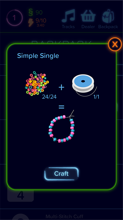
4.14 Tap Craft.
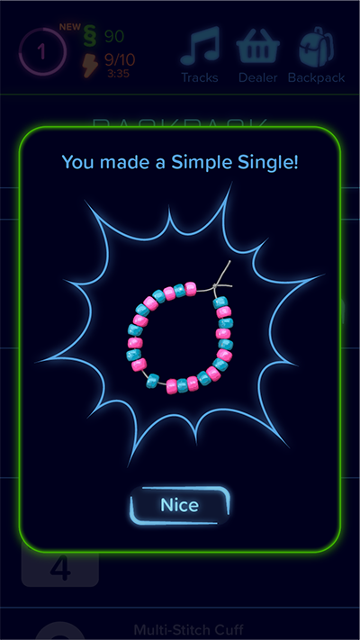
4.15 Tap Nice.
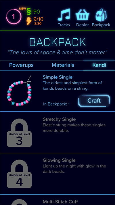
4.16 Go back to Tracks.
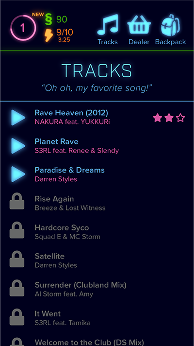
4.17 Select the track in question.
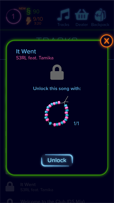
4.18 Tap Unlock.
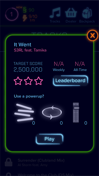
4.19 Exit the track preview.
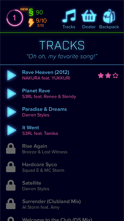
4.20 The track is now available in the track list.
Goal: Purchase any powerup.

5.1 Go to the Dealer from any page and tap the Powerups tab.
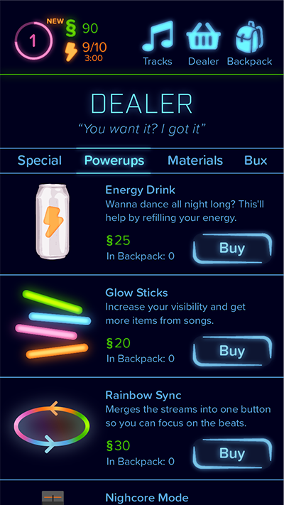
5.2 Read the powerup descriptions and choose one that sounds useful.
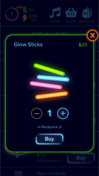
5.3 Tap Buy.
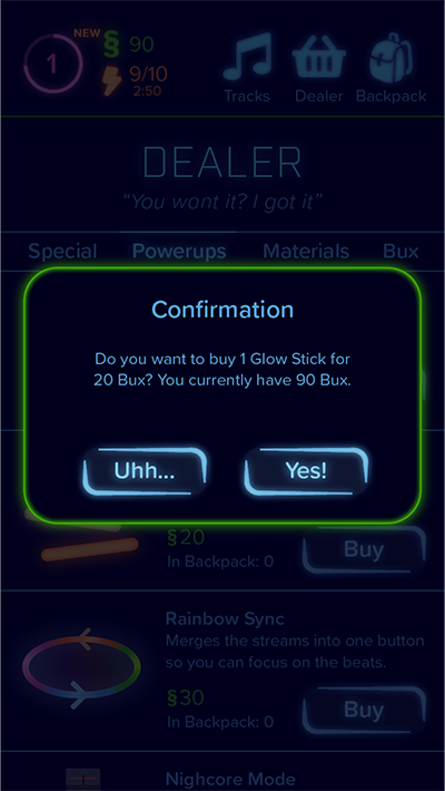
5.4 Tap Yes to confirm the purchase.
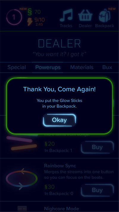
5.5 Tap Okay.
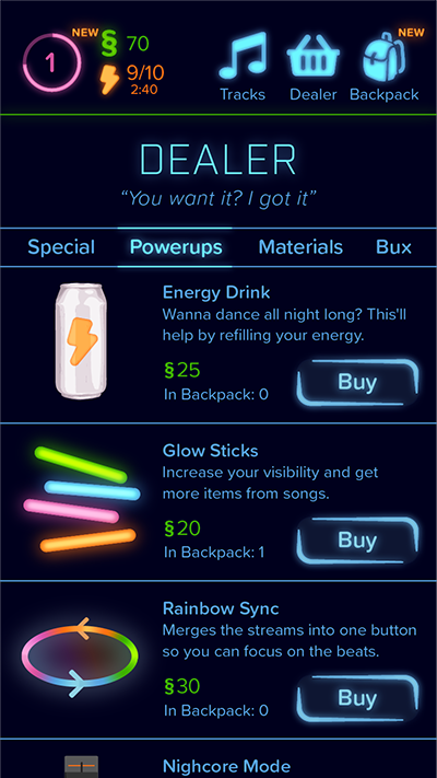
5.6 The Glow Sticks are now in the backpack.
Goal: Purchase 20 Bux.
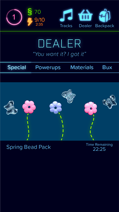
6.1 Go to the Dealer from any page and tap the Bux tab.
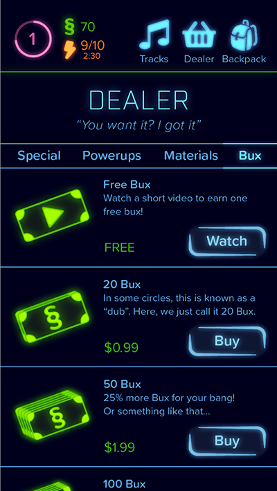
6.2 Tap Buy next to the 20 Bux.
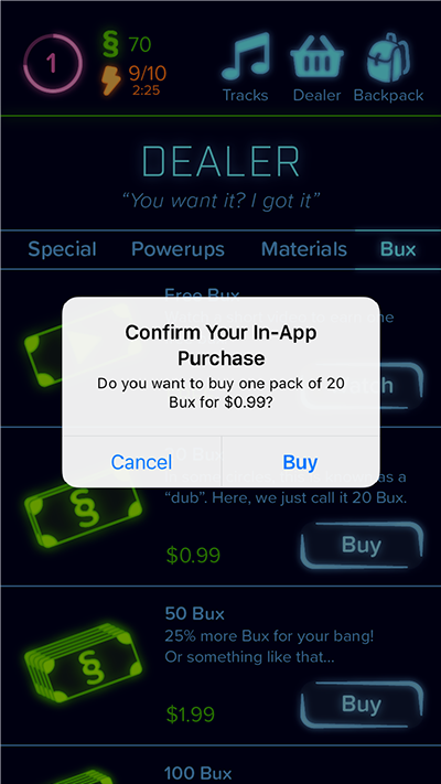
6.3 Tap Buy in the native prompt to confirm the purchase.
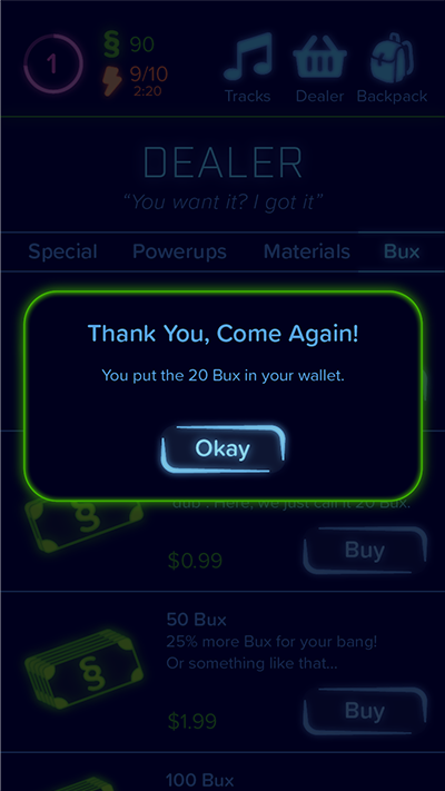
6.4 Tap Okay.
Goal: Complete a Goal and redeem the rewards.
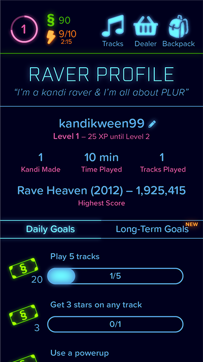
7.1 Access the Raver Profile from any screen via the display in the top left corner, then view Long-Term Goals.
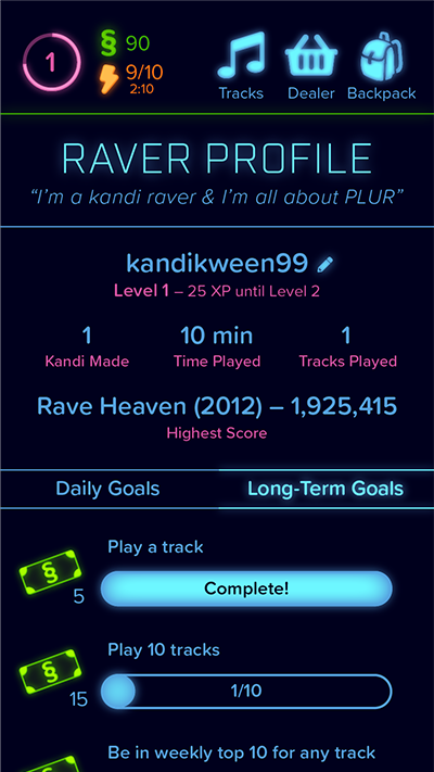
7.2 Tap Complete to collect the reward.
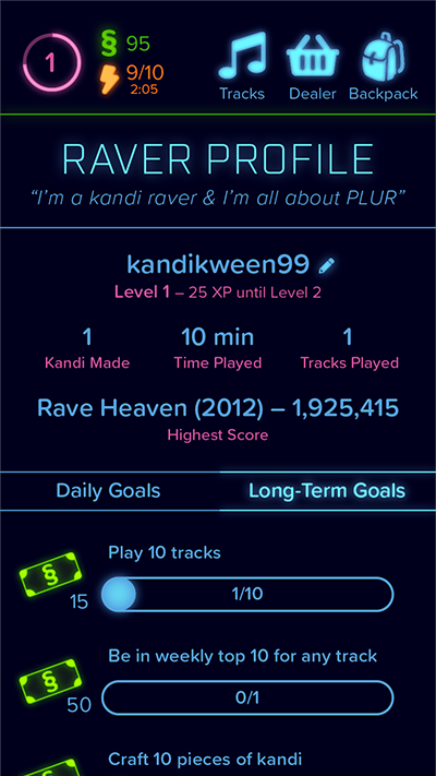
7.3 The reward bux have been added to the wallet.